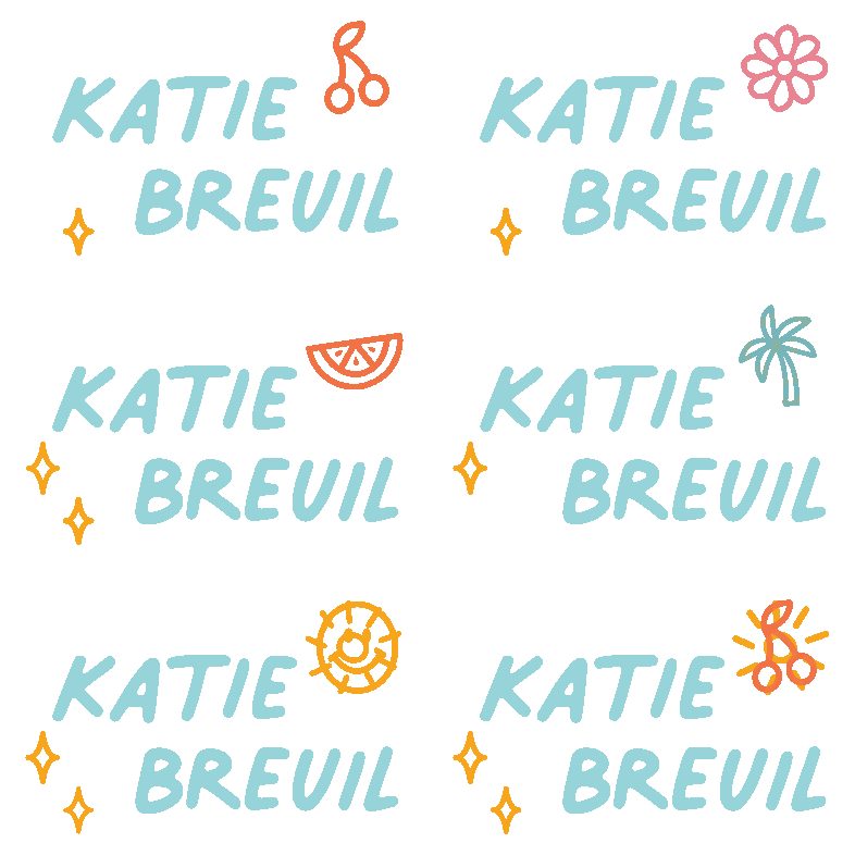
Katie is a web developer and friend of mine whose work I greatly admire. She came to me looking for a brand new logo to help begin the process of branding her portfolio site, invoices, and other business papers. Katie is inspired by her home state of Florida, hand lettered fonts, bright color palettes, and kawaii aesthetics. Together, we created a mood board to help solidify a visual direction to work from.

From our mood board, I set to work creating a few different logo directions to work from. I pulled a lot of inspiration from the delightful color palettes, cheery imagery, and beach themes to create a few mockups. I created an option using both fonts and hand lettered type.

Katie was most drawn to the option with the hand drawn sun and handwriting inspired font called Palmer Lake Print, an endearing font I discovered on the Creative Market which also includes a cursive variation. Katie was also drawn to the excitement of the multi-colored variation above, so I worked to create a logo system that would feel fresh by allowing her to choose the logo's icon from a variety of options. As a designer herself, Katie can eventually flesh out different meanings and use cases for each of these icons if she so desires. My goal was to provide a wide breadth of options for her to play with and choose from, so I included four different lockups, and a few additional elements for use in social media.


